


Seven Hills Design – Brand strategy for product design + engineering
–
Martin Cooper is a product designer and engineer. He had recently gone solo and requested the help of design studio Superfried to develop the branding strategy for his new Sheffield based company, Seven Hills Design.
Based on his feedback in the discovery stage and the services he provides I wanted to keep the logo marque clean, simple + geometric in form. With such a distinct name this provided a logical starting point. Various graphical representations of hills or the number 7 were explored. As a product designer, Martin develops 3D forms which led to a new isometric direction. A simple 3D 7 was emerging, but felt too sharp. Softening the corners revealed the hidden representation of a hill when rotated through 60 degrees.
The marque was elegant, but not unique. With products, the essential components under the surface are often unseen and overlooked. I liked the potential for contrast between the forms within compared to their container, so internal paths were tested. This led to some dramatic effects alluding to a technical 3D schematic and reiterating the numeral.
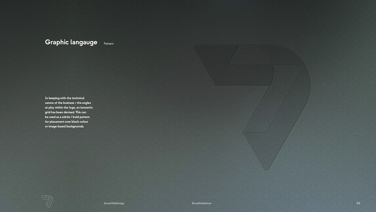
Via the new internal paths, the segmented construction of the logo would now provide opportunities for experimentation. Abstracted into separate components or used to contain multiple images resulted in a rich and versatile graphic language. In addition to this a simple isometric pattern was devised for use as subtle background device.
In stark contrast to the light wireframe marque, for the logotype a bold sans serif was selected. Since the name is so long, bespoke styling of the lettering was kept to a minimum. Iterations of the logotype and lock-ups were developed to cover all potential scenarios.
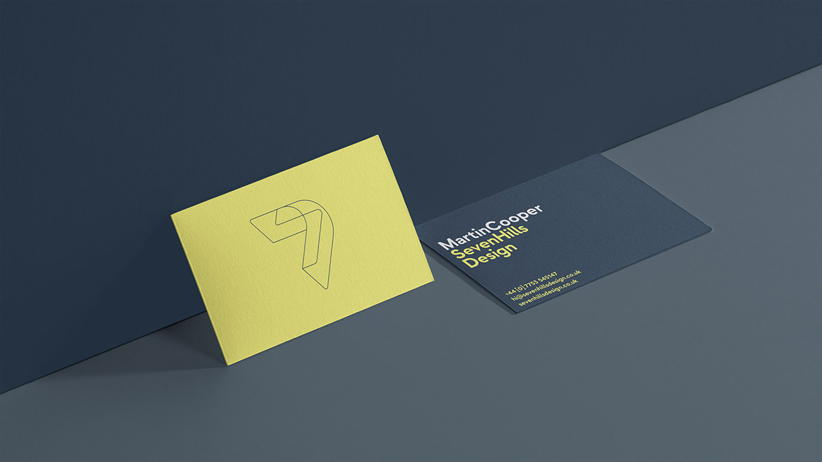
Moving onto the palette, the client had a preference for muted tones. Once established, it was advised that a highlight would be required when it was necessary to create emphasis or impact. Once again, taking a literal approach led to the use of a highlighter style, fresh yellow that would also work in CMYK.
For the typography, the base typeface used for the logotype – Strawford – was continued throughout to ensure the consistent, minimal style of the brand identity was maintained.


